 Fredrin
Blog
Broadleaf — Culture Journal (Parchment)
A journal for curious eyes and unhurried afternoons.
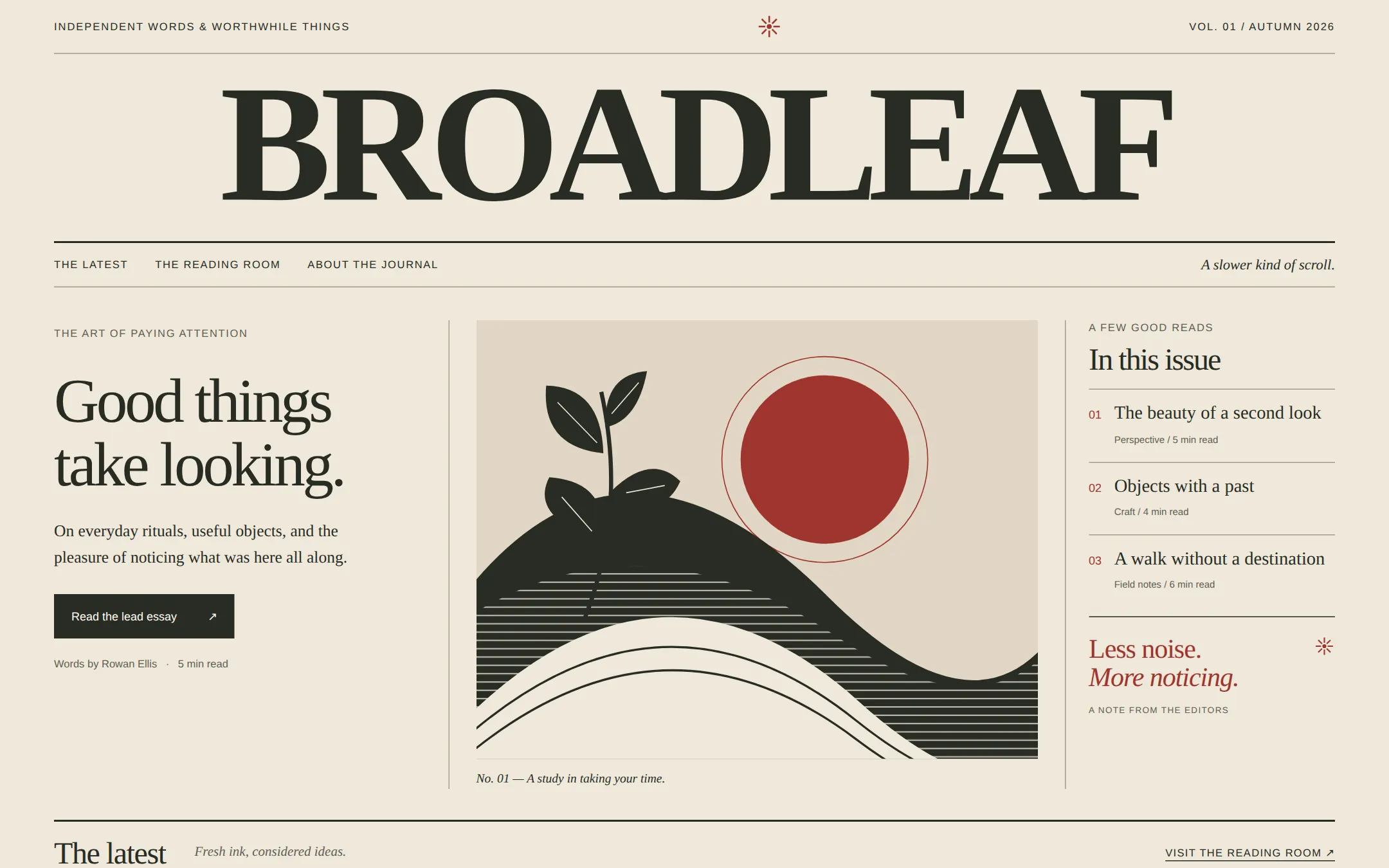
An independent journal laid out as a generous newspaper front page. A huge serif masthead anchors a warm parchment canvas; a lead essay, original landscape print and numbered reading list form the first spread. Ruled story columns lead to complete articles and an editor’s letter.
- Best for
- Independent publishers, culture writers and small creative studios with essays, field notes and a point of view.
- Tech stack
- - Next.js (App Router) - React Server Components - TypeScript - Plain CSS with custom properties - Local typed article content - System fonts and inline SVG artwork Use the latest stable Next.js with App Router. Keep this page server-rendered, with native anchor navigation and typed local article data. No CMS, database, client-side router state, account, analytics service, API key or paid dependency is necessary. Keep equivalent stack choices already present in the target repository.
- Tags
- journal · editorial · newspaper · serif · craft · parchment
The creation prompt
1268 words, self-contained. Paste it into a chat session with your coding agent and it builds Broadleaf — Culture Journal (Parchment) end to end.
Build the "Broadleaf — Culture Journal (Parchment)" kickstart — A journal for curious eyes and unhurried afternoons.

## Design
Make a readable, contemporary culture journal with the presence of a printed Sunday edition. Its personality comes from the masthead, a deliberate hierarchy of horizontal rules and an original landscape print. Keep a restrained paper-and-ink palette, with brick red for small editorial markers. The page is built from real article content and semantic markup, with no browser-frame decoration, cards floating over copy or image of a whole website.

### Palette
- background: #EEE8DA
- surface: #E0D6C4
- ink: #292C25
- muted: #625E53
- accent: #9F352D
- accentInk: #FFFAEF
- border: #A49B88

### Typography
Headings: Georgia, 'Times New Roman', serif
Body: Georgia, 'Times New Roman', serif
A bold uppercase masthead at clamp(44px, 12vw, 174px), with -0.065em tracking and 0.95 leading. Feature headline at clamp(40px, 4.5vw, 65px), normal weight, -0.045em tracking and 1.02 leading. Body 17px/1.6; Arial, Helvetica, sans-serif for 11–12px uppercase edition labels and navigation, tracked 0.1em.

### Page structure
1. Edition bar: Independent words & worthwhile things at left, a small eight-ray publication mark at center, and Vol. 01 / Autumn 2026 at right.
2. Masthead and navigation: BROADLEAF as the only h1, spanning the page; below, a fine rule and links to The latest, The reading room and About the journal, with A slower kind of scroll. at the far right.
3. Lead spread: a left text column with THE ART OF PAYING ATTENTION, the headline Good things take looking., a short introduction and Read the lead essay link; a central original landscape print with a figcaption; a narrower right column titled In this issue with three numbered article links and a brick-red editor’s note.
4. The latest: a ruled section heading followed by three story columns with small original SVG illustrations, category labels, linked headlines, excerpts and author/read-time metadata.
5. The reading room: three complete articles with their own anchor IDs, bylines and two or three original paragraphs each; each has a Back to the latest link.
6. About and footer: an editor’s letter, an email link for story pitches, the small publication name, issue details and a clear fictional-publication notice.

### Components and layout
Use a 1328px maximum content width and 56px desktop gutters. The edition bar is 56px tall; the masthead gets 12px above and 18px below. The navigation row is 48px with top and bottom rules. Place the lead spread 34px below it, in 0.95fr 1.35fr 0.65fr columns with 28px gaps and vertical rules between them. The center art occupies a 1.28:1 rectangle. Draw a graphic landscape in inline SVG: curved rows of dark-olive hills, a brick-red sun, a cream sky, and a small branch of broad leaves, with sparse parallel lines for a printmaking feel. Give the art an accessible title; hide the tiny decorative publication mark. The right reading list uses 01–03 labels and visible underlined article links. Separate the latest stories with vertical hairlines and use square cropped illustrations. No shadows, gradients, rounded cards, external images, paid fonts or stock logos. Body links are underlined; the lead link is an ink rectangle with cream text, 46px high. Focus outlines use the brick-red accent.

### Motion
Content is visible on first paint. Allow only 120ms color changes on links; remove transitions for prefers-reduced-motion. No reveal animation, ticker, parallax or auto-changing content.

At 1000px and below, use a two-column lead with the reading list spanning the width below. At 680px and below, stack the copy, artwork and reading list, reduce gutters to 20px, wrap the edition bar and navigation, and replace vertical rules with horizontal ones. Keep the masthead as real text that fits at 360px without clipping; shorten its size rather than stretching glyphs. Stack story columns and limit long-form text to 68ch. All text/background pairs clear WCAG AA. Preserve legibility at 200% zoom and without JavaScript.

## Tech stack
- Next.js (App Router)
- React Server Components
- TypeScript
- Plain CSS with custom properties
- Local typed article content
- System fonts and inline SVG artwork

Use the latest stable Next.js with App Router. Keep this page server-rendered, with native anchor navigation and typed local article data. No CMS, database, client-side router state, account, analytics service, API key or paid dependency is necessary. Keep equivalent stack choices already present in the target repository.
Where the repo you are working in already has an equivalent in place, keep the repo's choice and say which one you kept.

## Everything else
Build an independent culture and craft journal on the latest Next.js (App Router).

An independent journal laid out as a generous newspaper front page. A huge serif masthead anchors a warm parchment canvas; a lead essay, original landscape print and numbered reading list form the first spread. Ruled story columns lead to complete articles and an editor’s letter.

Broadleaf is a fictional independent publication. Lead introduction: “On everyday rituals, useful objects, and the pleasure of noticing what was here all along.” Lead article: The beauty of a second look, by Rowan Ellis, 5 min read, category Perspective. Other articles: Objects with a past, by Mira Vale, 4 min read, category Craft; A walk without a destination, by Ellis Reed, 6 min read, category Field notes. Art caption: No. 01 — A study in taking your time. Editor’s note: “Less noise. More noticing.” Use original essay copy about observation, repair and wandering. Label it A fictional journal / Sample edition in the footer; do not imply these authors or stories are real reporting.

Store the publication name, edition, email and three complete articles in one typed local configuration. Render the issue index, story previews and reading-room articles from that same collection so titles, bylines and targets agree. Each article must have a stable ID; the lead action and numbered index go to actual full articles on the page. Header navigation targets the latest stories, reading room and editor’s letter. Article return links target the latest section. The pitch link is a mailto URL using the configured address, with an encoded subject; do not show a fake submission form or claim a subscription was saved.

Write two or three thoughtful paragraphs per article rather than filler. Use observation-based prose, no invented quotations, endorsements, audience counts or real-world reporting claims. The sample date is fixed issue metadata, not the browser’s clock. The only external action is the email composer; all reading happens locally without JavaScript.

Use semantic header, nav, main, article, figure, figcaption and footer elements, one h1, a skip link, visible focus and meaningful link text. Do not put article prose inside SVGs or flatten content into an image. Keep all art in local inline SVG and all fonts in system stacks. Include a README for replacing the publication identity, articles, colors and contact address and running the page locally.

### Non-negotiables
- Responsive from 360px through desktop — no horizontal page overflow at any width. Deliberately scrollable regions stay within the viewport and remain keyboard and touch accessible.
- Every text/background pair clears WCAG AA (4.5:1 for body, 3:1 for large text); adjust a tint rather than shipping a failing pair.
- Fully keyboard operable, with a visible focus ring drawn in the accent colour.
- Honour `prefers-reduced-motion` — swap every transition for an instant state change.
- Write real copy in the voice described above; no lorem ipsum and no TODO placeholders.
- Use system or self-hosted fonts and CSS/SVG-drawn graphics — do not depend on a remote image or icon service.

Build the whole page end to end and show me the result running — not a description of it.
Pasting the prompt is step one. Fredrin runs the agent that builds it, one ticket per look.