 Fredrin
SaaS
Brex
A precise finance workspace in white, ink and a single orange accent.
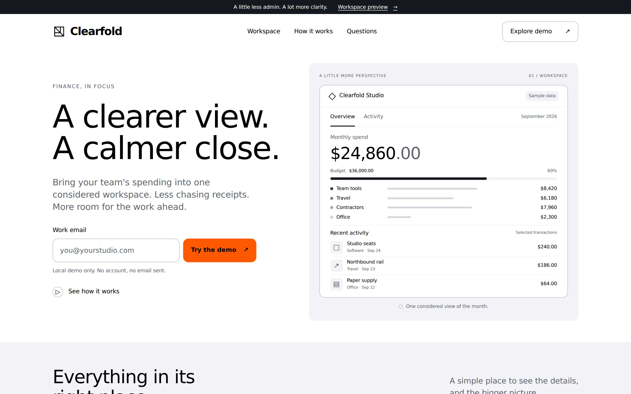
A bright finance-workspace landing page with a crisp asymmetric hero, an orange local-demo form and an actual HTML spending panel. Quiet gray surfaces, tightly set headings and flat rounded cards make the sample product easy to understand. A dark announcement strip and footer frame the page.
- Best for
- Small software teams presenting expense tools, finance workspaces or business operations products.
- Tech stack
- Use the latest stable Next.js with the App Router, React and TypeScript. Preserve equivalent choices already present in an existing repository. Use Server Components for the page and small Client Components for the local email form and workspace view switch. Style with plain CSS and custom properties. Native buttons, email input, anchors and details/summary are sufficient; reuse accessible primitives if already installed. Put editable branding, navigation, amounts, category rows and copy in one typed local configuration. Use local or system fonts, with no external image or font requests. No database, authentication, payment SDK, analytics, API keys or paid service is required. Every interaction works locally without a backend. - Next.js (App Router) - React - TypeScript - CSS custom properties - Local React state
- Tags
- finance · workspace · light · orange · product · minimal
The creation prompt
1751 words, self-contained. Paste it into a chat session with your coding agent and it builds Brex end to end.
Build the "Brex" kickstart — A precise finance workspace in white, ink and a single orange accent.

## Design
Create a bright, precise finance-workspace landing page for Clearfold. At desktop widths, use a centered 1200px content area with 32px outer gutters, an 8px spacing rhythm, 48–80px section gaps and 24–32px card padding. A slim 32px dark announcement strip sits above an 80px white navigation bar. Build an asymmetric hero with approximately 45% text and 55% live product UI. Place the small eyebrow, large left-aligned headline, left-aligned lead and email form in the left column. The right column is a Fog stage with a real white HTML spending panel, not an image of an interface. At 1440px, the hero ends around 700px so the next section begins in the first viewport.

Define CSS variables for Paper #FFFFFF, Fog #F3F3F7, Ink #000000, Graphite #60646C, Pewter #6F737B, Mist #B9BBC6, Steel #8B8D98, Carbon #15191E, Abyss #000710 and Ember #FF5900. Paper is the canvas and card surface; Fog separates the product stage and feature band. Body text uses Graphite, headings use Ink. Reserve Carbon for the top announcement and Abyss for the footer. Steel is for nonessential line icons only; use Graphite for readable small text and placeholders. No second accent color. Orange marks the single primary action in a region; it is not a decorative background or chart color. Use black labels on orange to meet contrast, an accessibility adaptation of the source's white labels. Inline links are underlined Ink. An active workspace view uses Ink and an underline, avoiding competing orange accents.

Use locally served Inter if available, otherwise ui-sans-serif, system-ui, -apple-system, Segoe UI, sans-serif. System sans is an explicit open-font adaptation of the licensed display face. Hero type is 72px/1 at weight 500 with -0.03em tracking; headings are 48px/1.2 at 500 with -0.025em; card headings 24px/1.33 at 500 with -0.01em; body 16px/1.5 at 400; lead 20px/1.4; labels 14px at 500. Disable contextual alternates and ligatures with font-feature-settings: 'calt' 0, 'liga' 0. Use tabular numbers in the workspace. The source's named em tracking rules take precedence over inconsistent px snippets. Do not use heavy 700+ display type.

Give buttons, inputs and cards 12px corners, small tags 6px corners. Use hairline Mist borders where separation is needed; cards otherwise separate through Paper against Fog. No shadows or gradients. The original brand mark is a square outline with one diagonal fold, never another company's mark. Functional icons may use original inline SVG, 1.5px strokes and currentColor. Keep every input and button at least 44px tall; persistent field labels and a 2px Ink focus outline with 3px offset are mandatory.

The hero product stage holds a white sample workspace with a header, Overview and Activity buttons, a large monthly total, a neutral horizontal budget meter with written values, category rows, and recent activity. This live HTML product view replaces licensed product photography; there are no external assets to obtain. At desktop it is roughly 580px wide and 470px tall with 24px internal padding; size from content without clipping. Initial view is Overview. The rest of the page uses a Fog feature band with three equal white cards, a white three-step explanation, native disclosure questions, and a dark full-width footer with real anchor links. No testimonial or customer-logo strip.

At widths below 900px, stack hero text and workspace, wrap navigation and stack feature cards. At 600px reduce gutters to 20px, hero to 42px/1.05 and section headings to 32px. Stack the email field and button at small widths. Keep the workspace readable at 320px by wrapping headers and activity rows rather than shrinking text or hiding content. No page-level horizontal overflow. Only 150ms hover/focus color transitions; prefers-reduced-motion removes them. Content is visible before JavaScript runs.

Typography stack: Inter, ui-sans-serif, system-ui, -apple-system, 'Segoe UI', sans-serif.

Page structure:
1. Announcement and header: a slim Carbon strip, an original folded-square Clearfold mark, Workspace, How it works and Questions anchors, and an outlined Explore demo link.
2. Asymmetric hero: the left column contains a small FINANCE, IN FOCUS label, A clearer view. A calmer close. headline, short lead, labeled work-email form and secondary How it works link. The right column is a live sample spending workspace on a Fog stage.
3. Workspace: a white panel with Clearfold Studio, Sample data badge, Overview and Activity buttons, monthly spend, a labeled category breakdown and three recent sample transactions. The Activity view replaces the breakdown with a longer transaction list.
4. Feature band: Fog surface with Everything in its right place. heading and three white cards about visibility, receipts and deliberate spending.
5. How it works: three numbered steps for exploring the sample, adapting categories and making the page your own.
6. Questions: native disclosure rows about the fictional product, sample data and local form behavior.
7. Footer: full-width Abyss surface with Clearfold, section links and an explicit fictional-demo disclosure.

## Tech stack
Use the latest stable Next.js with the App Router, React and TypeScript. Preserve equivalent choices already present in an existing repository. Use Server Components for the page and small Client Components for the local email form and workspace view switch. Style with plain CSS and custom properties. Native buttons, email input, anchors and details/summary are sufficient; reuse accessible primitives if already installed. Put editable branding, navigation, amounts, category rows and copy in one typed local configuration. Use local or system fonts, with no external image or font requests. No database, authentication, payment SDK, analytics, API keys or paid service is required. Every interaction works locally without a backend.

- Next.js (App Router)
- React
- TypeScript
- CSS custom properties
- Local React state
Where the repo you are working in already has an equivalent in place, keep the repo's choice and say which one you kept.

## Everything else
Build a finance-workspace landing page with a local spending demo on Next.js (App Router).

Build a complete responsive finance-workspace landing page for the fictional product Clearfold. This is an interactive product presentation, not a banking service. Use original copy and an original folded-square mark. The announcement reads A little less admin. A lot more clarity. with a Workspace preview link to #workspace. Header links go to Workspace (#workspace), How it works (#how-it-works) and Questions (#questions); its outlined Explore demo action also reaches #workspace.

Hero eyebrow: FINANCE, IN FOCUS. Headline: A clearer view. A calmer close. Lead: Bring your team's spending into one considered workspace. Less chasing receipts. More room for the work ahead. Show a persistent Work email label, type=email field with placeholder [email protected] and orange Try the demo button. The small helper says Local demo only. No account, no email sent. A secondary See how it works link goes to #how-it-works. On submission trim and validate the email locally; show an associated inline error for empty or malformed values and preserve input. A valid submission announces Your demo is ready below. Nothing was sent or saved. and reveals a link to the workspace. Do not send requests, persist the email or interpolate it into the success text. Keep this as a demo, not a newsletter or account signup.

The workspace is labeled Clearfold Studio with a Sample data badge and a September 2026 period. Overview and Activity are ordinary buttons with aria-pressed and visible keyboard focus. Switching updates the visible panel and a polite status announcement. Initial Overview shows Monthly spend $24,860.00 and Budget $36,000.00, with a neutral progress meter labeled $24,860 of $36,000, 69%. Four category rows show Team tools $8,420, Travel $6,180, Contractors $7,960 and Office $2,300, summing to the monthly spend. Use grayscale bars and written values, never color alone. Recent activity contains three rows: Studio seats / Software / Sep 24 / $240.00; Northbound rail / Travel / Sep 23 / $186.00; Paper supply / Office / Sep 22 / $64.00. Activity replaces the overview with those rows plus Design partner / Contractors / Sep 21 / $1,200.00 and Cloud workspace / Software / Sep 20 / $89.00. State clearly that these are selected sample transactions, not a reconciliation of the monthly total. Switching back restores Overview. No dead menus, inert export controls or fake live data.

The feature band reads Everything in its right place. with supporting copy A simple place to see the details, and the bigger picture. Cards: 01 A shared point of view — See sample spending grouped into clear, familiar categories. 02 Fewer loose ends — Bring the important details into a single, readable activity list. 03 Room to be deliberate — Compare the sample total with a visible budget before the next decision. Use small functional monochrome icons, not decorative images.

How it works has the heading Start with a little clarity. Three steps: Explore the workspace (Switch between the overview and sample activity.), Make the categories yours (Edit the local content configuration to reflect your team.), Keep the useful details (Adapt the page, copy and tokens as the product takes shape.). Questions use native details/summary: Is Clearfold a financial service? (No. It is a fictional product demo and does not move money or open accounts.); Are these live transactions? (No. All amounts, names and dates are fixed sample data.); What happens to my email? (Validation runs only in this page. Nothing is sent, stored or subscribed.). Footer repeats the section links and says Clearfold is a fictional demo. All financial figures and transactions are sample data.

Use semantic landmarks, one h1, labeled controls, visible keyboard focus and accessible status messages. Every link reaches a real section and every button performs its stated action. Keep all content readable at 320px and keyboard operable. Include a short README describing how to change the identity, copy, tokens and sample data. Deliver the whole page through the footer, not a screenshot-sized mock.

### Non-negotiables
- Responsive from 360px through desktop — no horizontal page overflow at any width. Deliberately scrollable regions stay within the viewport and remain keyboard and touch accessible.
- Every text/background pair clears WCAG AA (4.5:1 for body, 3:1 for large text); adjust a tint rather than shipping a failing pair.
- Fully keyboard operable, with a visible focus ring drawn in the accent colour.
- Honour `prefers-reduced-motion` — swap every transition for an instant state change.
- Write real copy in the voice described above; no lorem ipsum and no TODO placeholders.
- Use system or self-hosted fonts and CSS/SVG-drawn graphics — do not depend on a remote image or icon service.

Build the whole page end to end and show me the result running — not a description of it.
Pasting the prompt is step one. Fredrin runs the agent that builds it, one ticket per look.