 Fredrin
Corporate
Auros
A deep-water research desk: abyssal teal, one bioluminescent orb and statistics that glow pale pink.
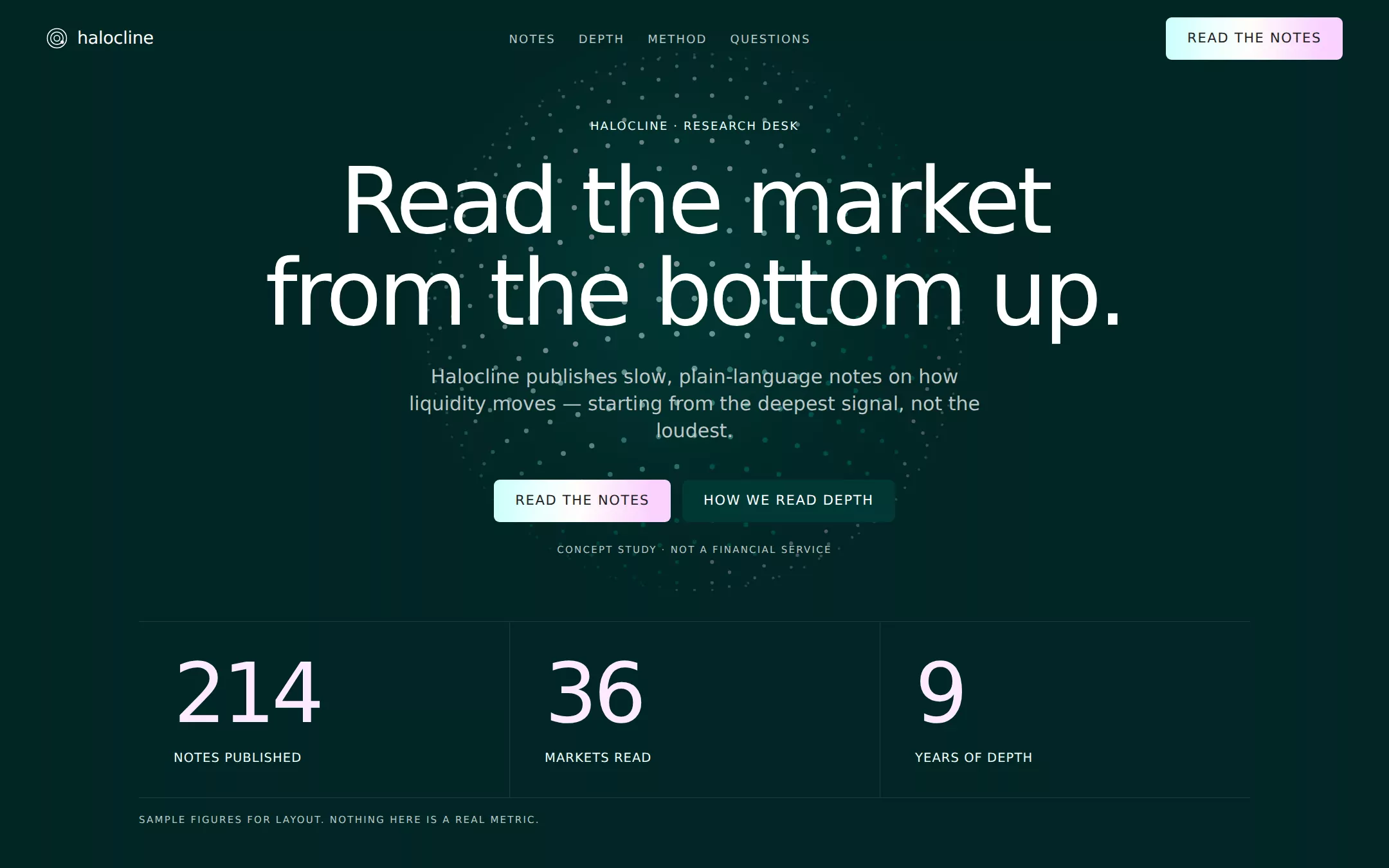
An original Halocline research-desk page on an abyssal teal canvas: a transparent navigation, a centered hero over a static SVG particle orb, lavender-phosphor sample statistics, an asymmetric explore section with hairline feature rows and a geometric molecule illustration, an oversized depth marker, a recessed questions well and a deep footer. The aurora gradient fills only the primary buttons.
- Best for
- Trading firms, market-research desks, fintech infrastructure and any institution that wants to feel calm, deep and instrument-like.
- Tech stack
- - Next.js (App Router) - React - TypeScript - CSS custom properties - Native HTML disclosures Use Next.js App Router, React and TypeScript with plain CSS custom properties and original inline SVG. Preserve equivalent tools already installed in the host project. Implement this as a server-rendered page; generate the orb's dots and the molecule's circles at build time in a server component, so no client component, canvas, WebGL or animation library is needed. Native details and anchors need no JavaScript. Use system font stacks only — no remote font, image, logo, icon or analytics host. Provide page metadata. Build and run the production page before capturing its preview.
- Tags
- fintech · dark · institutional · cinematic · research
The creation prompt
1535 words, self-contained. Paste it into a chat session with your coding agent and it builds Auros end to end.
Build the "Auros" kickstart — A deep-water research desk: abyssal teal, one bioluminescent orb and statistics that glow pale pink.

## Design
Build a rebrandable institutional research-desk landing page.

Create a complete landing page for Halocline, a fictional research desk that publishes plain-language notes on how liquidity moves between markets. Its core idea: depth is easier to read than noise, so every note starts from the deepest, slowest signal. This is a concept presentation, not a real financial service — no trading, no accounts, no wallets, no yields, no prices and no performance claims. Use original branding and copy throughout.

Color: the canvas is Liquid Abyss #012624, a near-black teal. Liquid Deep #011D1C is the recessed level — the questions well and the footer. Liquid Kelp #003734 is the raised card surface and the small icon-button fill. Headings and navigation are Platinum #FFFFFF; body and secondary text are Silver Mist #BBC7C6; emphasised body, eyebrows and stat labels are Liquid Mist #EDFFFE. Lavender Phosphor #FDE9FF is only for large sample statistics. Hairlines are rgba(255,255,255,0.1), which reads as #1A3C3A on the canvas. The one chromatic gesture is the Aurora gradient linear-gradient(90deg, #CBFFFC 0%, #EDFFFE 26%, #FFFDFA 48%, #FAD1FF 89%) — used only as the fill of the primary action buttons, with #222222 text; never on text, borders or backgrounds larger than a button. The Bioluminescent gradient linear-gradient(90deg, #00827C, #CBFFFC) may appear only inside the hero orb. No other hues, no drop shadows: depth is the surface stack Deep → Abyss → Kelp.

Typography: one family. Use Inter, "DM Sans", ui-sans-serif, system-ui, -apple-system, "Segoe UI", Roboto, Helvetica, Arial, sans-serif — a locally installed geometric grotesk stands in for the source's licensed face, with no remote font request. Headings are weight 500 only, never bold or light; body and UI are 400. Hero h1 clamp(2.75rem, 6.6vw, 6rem)/1.0 with -0.04em tracking; oversized section marker 200px/1.0 at -0.046em; section headings 61px/1.0 at -0.04em; card headings 36px/1.0; subheads 24px/1.3 at -0.02em; body 16px/1.4; eyebrows 12px uppercase 500 with 0.12em tracking; captions 10px uppercase with 0.15em tracking; buttons 14px uppercase with 0.08em tracking. Radii are exactly two values: 16px for cards and 6px for buttons, tags and icon buttons — no pills. Base unit 4px; 20px element gaps, 36–48px card padding, at least 120px between sections; content column max 1200px inside a 1440px page.

Transparent navigation: an 80px bar. Left: an original mark — three concentric thin Platinum rings with one Lavender Phosphor dot, inline SVG — and the word halocline in 18px Platinum weight 500. Center: ghost links NOTES, DEPTH, METHOD, QUESTIONS in 12px uppercase 0.12em tracking, Silver Mist, Platinum on hover and focus, 24px apart. Right: an Aurora-gradient 6px button READ THE NOTES. Every link is an anchor to a real section.

Centered hero over a particle orb: a centered stack filling most of the first viewport over a particle orb. The orb is original inline SVG or CSS: a 560px sphere of a few hundred small dots arranged on latitude rings, teal #00827C at the rim brightening to #CBFFFC and white toward the lit upper-left, with a faint Lavender Phosphor rim on the lower-right, over a soft radial glow of #003734 — no canvas, WebGL or image file, and it stays still. Over it: the eyebrow HALOCLINE · RESEARCH DESK in Liquid Mist, the h1 Read the market from the bottom up. in Platinum over two lines, a 20px Silver Mist sentence Halocline publishes slow, plain-language notes on how liquidity moves — starting from the deepest signal, not the loudest., and two buttons: the Aurora READ THE NOTES and a Kelp 6px button HOW WE READ DEPTH with Platinum text. Beneath, a 10px caption CONCEPT STUDY · NOT A FINANCIAL SERVICE.

Sample statistics (id depth): a three-column row on the canvas with hairlines between columns. Each has a Lavender Phosphor value at 86px/1.0 weight 500 with -0.046em tracking — 214, 36, 9 — and a 13px uppercase Liquid Mist label beneath: NOTES PUBLISHED, MARKETS READ, YEARS OF DEPTH. A 10px Silver Mist caption: Sample figures for layout. Nothing here is a real metric.

Explore: feature rows and a molecule illustration (id notes): an asymmetric two-column section. Left column: the eyebrow EXPLORE, the 61px heading Three ways into the deep., then three Feature Row cards stacked with 20px gaps — transparent with a 1px hairline and 16px radius, 48px by 36px padding — each with a 36px Platinum heading, a 16px Silver Mist body and, top-right, a 32×32 6px icon button filled rgba(3,81,75,0.5) holding a thin white ↗ arrow: Field notes / Weekly readings of where depth is building and thinning.; Flow maps / Diagrams of how liquidity crosses venues, drawn by hand.; The glossary / Every term a note uses, defined once, in plain words. Right column: an original geometric molecule illustration in inline SVG — eight to ten white or Silver Mist circles of three sizes joined by 1px connector lines, one circle in Lavender Phosphor — sitting in a Liquid Kelp 16px card with 48px padding.

Oversized depth marker with method cards (id method): a full-width band where the word depth is set at 200px Platinum weight 500, -0.046em tracking, left-aligned and allowed to crop at the right edge, followed by two Kelp surface cards side by side (16px radius, 36px padding): Start at the floor. / Every reading begins with the slowest-moving signal and works upward.; Say it plainly. / If a note needs jargon, the glossary defines it first.

Recessed native questions (id questions): a Liquid Deep recessed card, 16px radius, 120px vertical padding, with the 61px heading Plain answers. and four full-width details elements divided by hairlines, 24px Platinum summaries with a thin + glyph: Is Halocline real? — no, it is a fictional design study. Are the figures real? — no, every number is sample data for layout. Can I trade or invest here? — no; there are no accounts, products or prices. Who is it for? — readers who prefer depth to noise. Summaries show a 2px Liquid Mist focus ring.

Deep footer: Liquid Deep background, 120px top and 64px bottom padding, the halocline wordmark in Platinum, three columns of 14px Silver Mist links (Notes, Depth, Method, Questions, Back to top) that resolve to real anchors, and a 12px Silver Mist line Halocline is a fictional concept. Not a bank, exchange, broker or financial service, and not affiliated with any trading firm. No logos, testimonials, token names, prices or app badges.

At 760px and below: 16px gutters, a 44px hero h1, 40px section headings, a 320px orb, stacked hero buttons at full width, a one-column statistics stack with 56px values, one-column explore with the illustration below the cards, the oversized marker at 96px, and navigation links collapsed to QUESTIONS plus the Aurora button. The page fits a 360px viewport with no horizontal page overflow (clip the marker inside its band). Use semantic landmarks, one h1, a skip link, visible focus, decorative SVG hidden from assistive technology, WCAG AA contrast on every text pair (the Aurora fill always carries #222222 text) and keyboard-operable details. Everything works without JavaScript.

## Tech stack
- Next.js (App Router)
- React
- TypeScript
- CSS custom properties
- Native HTML disclosures

Use Next.js App Router, React and TypeScript with plain CSS custom properties and original inline SVG. Preserve equivalent tools already installed in the host project. Implement this as a server-rendered page; generate the orb's dots and the molecule's circles at build time in a server component, so no client component, canvas, WebGL or animation library is needed. Native details and anchors need no JavaScript. Use system font stacks only — no remote font, image, logo, icon or analytics host. Provide page metadata. Build and run the production page before capturing its preview.
Where the repo you are working in already has an equivalent in place, keep the repo's choice and say which one you kept.

## Everything else
Keep Halocline clearly fictional and rebrandable: no source wordmark, particle-sphere footage or copy, no real firm, exchange, token or fund names, no logos, testimonials, prices, yields, volumes or performance claims. Every figure is labelled sample. Every link leads to a real section on the page. Deliver initially visible content with no scroll reveals; the orb is static, and any hover transition is a 200ms colour change disabled for prefers-reduced-motion. WCAG AA contrast on every text/background pair, keyboard-operable questions and a 360px layout without horizontal page overflow.

### Non-negotiables
- Responsive from 360px through desktop — no horizontal page overflow at any width. Deliberately scrollable regions stay within the viewport and remain keyboard and touch accessible.
- Every text/background pair clears WCAG AA (4.5:1 for body, 3:1 for large text); adjust a tint rather than shipping a failing pair.
- Fully keyboard operable, with a visible focus ring drawn in the accent colour.
- Honour `prefers-reduced-motion` — swap every transition for an instant state change.
- Write real copy in the voice described above; no lorem ipsum and no TODO placeholders.
- Use system or self-hosted fonts and CSS/SVG-drawn graphics — do not depend on a remote image or icon service.

Build the whole page end to end and show me the result running — not a description of it.
Pasting the prompt is step one. Fredrin runs the agent that builds it, one ticket per look.