 Fredrin
E-commerce
Apple iPhone Duo
A spacious white product gallery for a notebook that opens up possibilities.
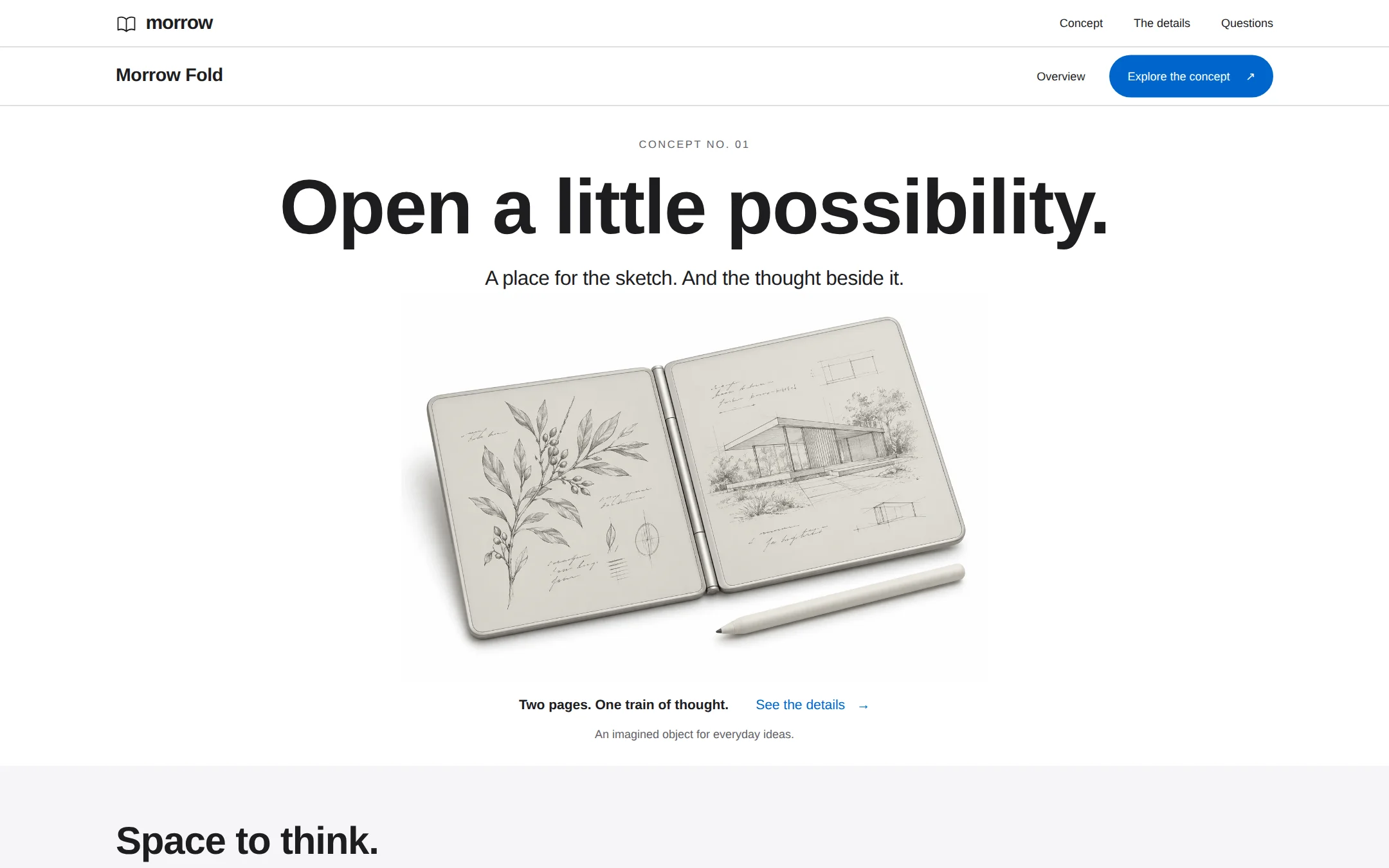
An original Morrow Fold concept page with a sculptural notebook photograph, compact blue actions, spacious typography and native product disclosures. White and mist-gray chapters tell a complete fictional product story without checkout or invented claims.
- Best for
- Independent hardware concepts, design prototypes and product storytellers.
- Tech stack
- - Next.js (App Router) - React - TypeScript - CSS custom properties - Native HTML disclosures Use Next.js App Router, React and TypeScript with plain CSS custom properties and original inline SVG. Preserve equivalent tools already installed in the host project. Implement this as a server-rendered page; native HTML disclosures and anchors need no client component or dependency. Use system fonts. Serve the original product asset locally; no external image, icon, analytics or font host. Provide page metadata and responsive image dimensions. Build and run the production page before capturing its preview.
- Tags
- hardware · minimal · white · product · editorial
The creation prompt
1266 words, self-contained. Paste it into a chat session with your coding agent and it builds Apple iPhone Duo end to end.
Build the "Apple iPhone Duo" kickstart — A spacious white product gallery for a notebook that opens up possibilities.

## Design
Build a rebrandable concept-product landing page for a folding digital notebook.

Create a complete product-story page for Morrow Fold, a fictional folding digital notebook. Its core idea is one quiet place to collect a sketch and the thought beside it. This is a concept presentation, not a working device or store. Use original branding and copy throughout.

Use a #FFFFFF canvas with #F5F5F7 full-width feature bands and white cards. Headings and body are #1D1D1F; secondary text is #626266, darker than typical pale hardware-site captions to meet WCAG AA. Use #D6D6D6 only for fine separators. Links, focus outlines and the single compact primary action use #0066CC, with #FFFFFF on the filled action. Keep blue out of large surfaces. No gradients or shadows on page containers. The product image may contain a natural contact shadow. Do not put the hero inside a bordered card.

Typography is Arial, Helvetica, sans-serif: a locally available, open system substitute, with no remote font request. At desktop use 80px/1.05 at weight 600 and -1.2px tracking for the h1, 40px/1.1 for h2, 24px/1.2 for feature headings, 21px for the hero lead, 17px/1.5 for body, and 12–14px for navigation and captions. The product wordmark is 19px at 600. Use a 4px spacing grid and a centered 1200px main column, with 48px minimum desktop gutters and 80–96px between storytelling chapters. Large media cards have 28px corners; buttons are pills with at least 44px interactive targets.

Quiet global and product navigation: the first white row is 48px tall with a small original two-leaf line mark and morrow wordmark on the left, and Concept, The details and Questions links on the right. Every link points to a real section. Below a fine silver divider, a 60px product row shows Morrow Fold on the left. An unfilled Overview link and one blue Explore the concept anchor sit on the right. No fake store navigation, bag, account or disabled Buy button.

Centered notebook launch hero: begin 32px below the product row with a small CONCEPT NO. 01 label. Set the single-line desktop h1 Open a little possibility. on the next line; it may wrap naturally at narrower widths. Under it, a centered 21px lead reads A place for the sketch. And the thought beside it. Put an isolated original product photograph directly below, approximately 820px wide by 405px high at 1440px viewport width, object-fit contain on white. Show a pearl-silver two-panel e-paper notebook, opened like a book, with a fine botanical drawing on the left and a pavilion sketch on the right; a matching stylus rests below. No phone silhouette, cameras, source logo, readable borrowed screen copy, or surrounding interface in the artwork. Use the adjacent assets/folding-notebook.webp if available, copying it into the app public assets. In a project with only this pasted prompt, create an original local SVG representation of this same fictional notebook and line drawings instead; never hotlink or assume this repository's asset exists. The entire page outside this isolated product artwork must be real semantic HTML. Provide a descriptive alt text. Beneath the image, show a small centered row: Two pages. One train of thought. followed by an understated See the details arrow link. Add the caption An imagined object for everyday ideas. Let the next mist-gray chapter begin near the bottom of a 900px desktop viewport.

Three ways to make room: a full-width #F5F5F7 section with 56px top and 80px bottom padding. At the top align a 40px heading Space to think. / Room to begin. on the left and the text link About this concept on the right. Under it, three equal white cards with 28px corners, 28px padding and no shadow. Number them 01, 02 and 03. Their titles and descriptions are A thought, unfolded. / Put a sketch beside a sentence. Follow the connection.; Less to carry. / One imagined notebook, ready for the ideas you take with you.; A quieter canvas. / Space for a first draft, without another feed to follow. Pair each with simple original thin-stroke inline SVG: two leaves, a folded notebook and a pencil path. No fabricated performance numbers or implied shipping product.

Native product questions: return to white with a 40px heading A few things to know. and three full-width details elements separated by hairlines. Is Morrow Fold a real product? explains it is a fictional industrial-design concept. Can I order one? explains there is no purchase, preorder or waitlist. What is shown on the pages? explains the botanical and architectural sketches are original illustrative artwork, not a working screen. Keep all answers in the server-rendered HTML and use native summary controls with keyboard focus.

Fictional concept footer: a compact mist-gray footer with the original wordmark, a Back to top anchor and the clear line Morrow Fold is a fictional design study. No product is for sale. Do not claim affiliation with an existing manufacturer. No signup, email collection, price, customer logos or testimonials.

At 760px and below use 20px gutters, a 44px hero, 32px section headings and one-column feature cards. Let both nav rows wrap, keep every target usable and scale the product image proportionally without clipping. The entire page fits a 360px viewport with no horizontal overflow. Use semantic landmarks, one h1, a skip link, meaningful alt text, visible blue focus and WCAG AA text contrast. Static content and every anchor/disclosure must work without JavaScript. Use only 160ms color transitions; honor prefers-reduced-motion with instant changes. No animation may hide content at first paint.

## Tech stack
- Next.js (App Router)
- React
- TypeScript
- CSS custom properties
- Native HTML disclosures

Use Next.js App Router, React and TypeScript with plain CSS custom properties and original inline SVG. Preserve equivalent tools already installed in the host project. Implement this as a server-rendered page; native HTML disclosures and anchors need no client component or dependency. Use system fonts. Serve the original product asset locally; no external image, icon, analytics or font host. Provide page metadata and responsive image dimensions. Build and run the production page before capturing its preview.
Where the repo you are working in already has an equivalent in place, keep the repo's choice and say which one you kept.

## Everything else
Keep Morrow Fold clearly fictional and rebrandable. All links lead to real local sections, every question opens with the keyboard, and the original image has an honest description. There is no cart, payment, download, preorder, newsletter, account or remote request. Do not invent battery life, screen dimensions, materials testing, reviews, customer counts or sales figures. The notebook artwork depicts an idea rather than functioning hardware. Deliver readable, initially visible content with no-JavaScript anchors and disclosures, WCAG AA contrast, reduced-motion support and a narrow layout without overflow.

### Non-negotiables
- Responsive from 360px through desktop — no horizontal page overflow at any width. Deliberately scrollable regions stay within the viewport and remain keyboard and touch accessible.
- Every text/background pair clears WCAG AA (4.5:1 for body, 3:1 for large text); adjust a tint rather than shipping a failing pair.
- Fully keyboard operable, with a visible focus ring drawn in the accent colour.
- Honour `prefers-reduced-motion` — swap every transition for an instant state change.
- Write real copy in the voice described above; no lorem ipsum and no TODO placeholders.
- Use system or self-hosted fonts and CSS/SVG-drawn graphics — do not depend on a remote image or icon service.

Build the whole page end to end and show me the result running — not a description of it.
Pasting the prompt is step one. Fredrin runs the agent that builds it, one ticket per look.