 Fredrin
Portfolio
Afterimage — Design Portfolio (Dark)
A quiet frame for work with a point of view.
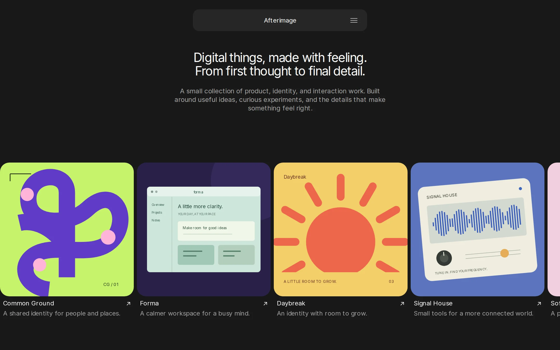
A dark exhibition wall for a small body of design work. A centered floating navigation pill and a compact two-line introduction leave room for a single full-width horizontal gallery. Color lives only inside the original project artwork; captions sit directly on the canvas.
- Best for
- Independent designers and small studios showing a focused collection of product, identity and interaction work.
- Tech stack
- - Next.js (App Router) - React Server Components - TypeScript - CSS custom properties - Local project data and inline SVG - Self-hosted Inter or system sans-serif Use the current stable Next.js App Router, React Server Components and TypeScript with plain CSS custom properties. Preserve equivalent choices already installed in the target repository. Keep identity and projects in one typed local configuration, render project links from it, and generate static local case-study pages from stable slugs. Use next/link for local navigation and native details/summary for the menu so navigation works without JavaScript. Use self-hosted, openly licensed Inter Regular with its license, or the documented system sans-serif fallback. Make all five artworks locally in inline SVG. No paid typeface, remote image or font host at runtime, CMS, database, account, API key, animation library or external service is needed. No client component is necessary for the homepage; its overflow row and menu are native browser features.
- Tags
- portfolio · horizontal · gallery · dark · minimal · design
The creation prompt
1514 words, self-contained. Paste it into a chat session with your coding agent and it builds Afterimage — Design Portfolio (Dark) end to end.
Build the "Afterimage — Design Portfolio (Dark)" kickstart — A quiet frame for work with a point of view.

## Design
Build a restrained dark portfolio that reads as a gallery wall: centered floating navigation, a small centered introduction, then one horizontal row of expressive project work. The frame is quiet; the art carries all color. This is a working website with semantic text and real navigation.

Use exactly these four chrome tokens: --canvas: #181818; --surface: #262626; --ink: #FAFAFA; --muted: #A3A3A3. The catalog accent is Bone (#FAFAFA) and accentInk is Obsidian (#181818); these are neutral focus/action roles, not permission to add a chromatic accent. Border, when needed for focus or control affordance, is Ash. No page gradients, shadows, texture, glow or decorative background. Keep both the page and its menu dark regardless of OS preference.

Use locally hosted Inter Regular (400) for body and as the open display fallback; Arial, Helvetica, sans-serif must work if it is unavailable. No paid font is required. Set the only h1 to 32px, line-height 1.10 and letter-spacing -0.04em. Body, navigation, titles and captions are 16px, weight 400, letter-spacing -0.009em. Intro is 17px/1.29 in Ash. Card titles use 1.18 leading and captions 1.5; all font weights stay at 400. Never use bold as hierarchy.

At 1440×900, float a 448×56px Graphite navigation pill at the top center with a 24px top margin and 16px corner radius. Center the wordmark and put a native menu disclosure at the right, with an accessible name and a 44px minimum target. Start the hero near y=136, limit it to about 580px and center the two-line h1. Leave 24px between heading and subtitle. After the introduction, leave roughly 128px of breathing room; the gallery should begin around y=420, with project captions visible inside the first viewport. Do not pin it in a way that overlaps text at smaller heights or 200% zoom.

The only homepage content row is a full-viewport-width horizontal gallery of five projects: flex, nowrap, overflow-x:auto, an 8px gap, and 344px-wide cards on desktop. Thumbnail aspect ratio is 1:1 with a 24px radius and zero padding. Their base is Obsidian or Graphite; original artwork fills the thumbnail edge to edge. Beneath each image leave 8px, then a Bone title with a small baseline ↗ arrow, then 4px and a one- or two-line Ash description. Metadata has 8px horizontal inset and no container fill, border or shadow. Do not use a multi-row grid, wrap cards, or add marketing sections, testimonials, a giant CTA or a footer to the homepage.

Art is original local inline SVG and may use saturated colors inside the thumbnails only. Compose five varied projects: Common Ground has a vivid lime field, a deep purple looping plant and small pink circular details; Forma shows a mint workspace interface on a deep violet field; Daybreak uses a coral disc with buttery yellow sun rays and a small editorial label; Signal House has an off-white sound instrument with cobalt waveform lines; Soft Assembly uses interlocking lilac and orange geometric forms on pale pink. Give each image a descriptive accessible title. Do not copy any existing company mark, project screenshot or portfolio image. Keep essential project names and descriptions as HTML outside the art.

Below 680px, give the hero 24px gutters, reduce the navigation width to calc(100% - 48px), and reduce the gap before the gallery to 64px. Cards become min(344px, 82vw), so the next card remains visible. Preserve the single horizontal row on mobile, with scrolling confined to its named, focusable gallery region. Keep the 32px heading and allow it to wrap; no horizontal document overflow at 320px, and no truncated captions. Use a visible Bone focus outline and semantic links. Touch, trackpad, tab and arrow keys must all reach every project. Native proximity scroll snap is optional; no autoplay, global wheel interception, or drag-only controls. All content is present without JavaScript. Honor reduced motion; restrict any hover transitions to 120ms opacity/underline changes and remove them for reduced motion.

### Typography families
Headings: Inter, Arial, Helvetica, sans-serif
Body: Inter, Arial, Helvetica, sans-serif

### Page structure
1. Floating navigation: a centered Afterimage wordmark in a 448px-wide, 56px-high Graphite pill, 24px from the top, with a real menu disclosure on its right.
2. Introduction: one centered h1, Digital things, made with feeling. From first thought to final detail., followed by a muted two-to-three-line introduction. Keep the text column about 580px wide and separate heading and subtitle by 24px.
3. Selected work: a single full-bleed horizontal overflow row with five large image-and-caption cards, 8px gaps and no surrounding card frame. A partial next card signals that the row scrolls.
4. Project details: each card links to its own local case-study page with a full-size artwork, short overview, role, process, outcome and a Back to selected work link. These pages do not add vertical sections to the homepage.
5. Navigation disclosure: Selected work, About this studio and Contact. About is a separate local page containing a short introduction and the fictional-work notice. Contact uses the configured email address.

## Tech stack
- Next.js (App Router)
- React Server Components
- TypeScript
- CSS custom properties
- Local project data and inline SVG
- Self-hosted Inter or system sans-serif

Use the current stable Next.js App Router, React Server Components and TypeScript with plain CSS custom properties. Preserve equivalent choices already installed in the target repository. Keep identity and projects in one typed local configuration, render project links from it, and generate static local case-study pages from stable slugs. Use next/link for local navigation and native details/summary for the menu so navigation works without JavaScript.

Use self-hosted, openly licensed Inter Regular with its license, or the documented system sans-serif fallback. Make all five artworks locally in inline SVG. No paid typeface, remote image or font host at runtime, CMS, database, account, API key, animation library or external service is needed. No client component is necessary for the homepage; its overflow row and menu are native browser features.
Where the repo you are working in already has an equivalent in place, keep the repo's choice and say which one you kept.

## Everything else
Build a horizontal product and brand design portfolio on Next.js (App Router).

Afterimage is a fictional independent design studio. Headline: Digital things, made with feeling. From first thought to final detail. Introduction: A small collection of product, identity, and interaction work. Built around useful ideas, curious experiments, and the details that make something feel right. Projects: Common Ground — A shared identity for people and places.; Forma — A calmer workspace for a busy mind.; Daybreak — An identity with room to grow.; Signal House — Small tools for a more connected world.; Soft Assembly — A playful study in form and movement. Use original inline SVG artwork: a lime-and-purple geometric botanical composition; a mint workspace interface on a deep violet field; oversized coral and butter-yellow sun shapes; a cream instrument panel with a cobalt waveform; and interlocking lilac and orange forms on pale pink. These are sample projects, not client endorsements. Use [email protected] as the configurable sample address.

Use a single typed collection for each project's slug, title, description, artwork, role and case-study text. Every visible gallery link opens a working local project page, with two or three original paragraphs covering the idea, design decisions and illustrative outcome, plus a return link to /#work. Clearly identify sample case studies as fictional concepts, and do not invent real client credits or measured business results. The five-card collection remains the only gallery on the homepage.

Selected work targets /#work. About this studio opens a working local /about page with concise studio copy and the fictional-sample notice. Contact is a mailto link using the configured address, never a fake form submission. The disclosure must be keyboard operable and links must have meaningful labels. Provide header, nav, main and article landmarks, one h1 on each route, a skip link, visible focus, accessible artwork titles, and content that stays usable without JavaScript and at 200% zoom. Do not hide the gallery scrollbar or its focus outline.

Write a README showing how to run the site and replace the identity, introductory copy, contact email, project data, SVG artwork and palette. The brief is self-contained: do not require fetching an inspiration site or its proprietary fonts/assets to build it.

### Non-negotiables
- Responsive from 360px through desktop — no horizontal page overflow at any width. Deliberately scrollable regions stay within the viewport and remain keyboard and touch accessible.
- Every text/background pair clears WCAG AA (4.5:1 for body, 3:1 for large text); adjust a tint rather than shipping a failing pair.
- Fully keyboard operable, with a visible focus ring drawn in the accent colour.
- Honour `prefers-reduced-motion` — swap every transition for an instant state change.
- Write real copy in the voice described above; no lorem ipsum and no TODO placeholders.
- Use system or self-hosted fonts and CSS/SVG-drawn graphics — do not depend on a remote image or icon service.

Build the whole page end to end and show me the result running — not a description of it.
Pasting the prompt is step one. Fredrin runs the agent that builds it, one ticket per look.