Pitch
A presentation-software landing page that opens on a deep-indigo sky of floating slides: a 180px geometric headline, one AI prompt box and a hero that melts from violet into white.
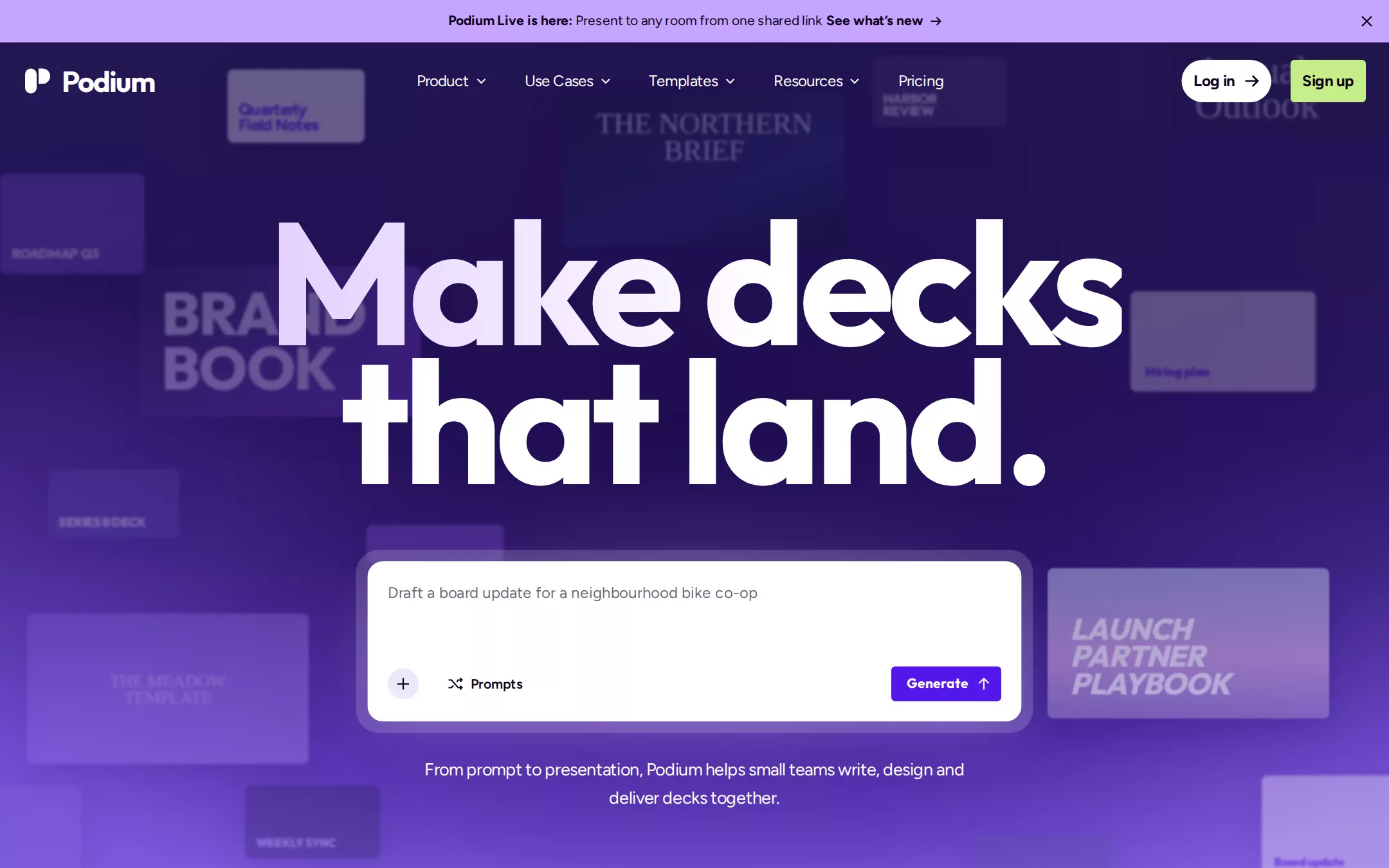
An original Podium presentation-tool page: a 44px lilac announcement bar, an 80px transparent navigation over the hero, a 1178px hero that runs from deep indigo through violet into white behind a field of softly blurred original slide thumbnails, a two-line 180px headline, a frosted AI prompt card with a violet Generate button, a centred lede, a row of invented customer wordmarks, a Why Podium section with a mono eyebrow, alternating feature rows, violet testimonial cards, a closing call to action and a quiet footer.
- Best forPresentation, document and creative-collaboration tools that lead with an AI prompt — slide builders, proposal and report generators, and design tools for teams.
- Tech stack- Next.js (App Router) - React - TypeScript - CSS custom properties Use Next.js App Router, React and TypeScript with plain CSS custom properties for every colour, radius and spacing token. Render the page as a server component; the announcement close button and the prompt card are the only small client components, and the prompt never submits anywhere. Self-host Outfit (700, 800), Figtree (400, 600, 700) and Space Mono (400) as woff2 through next/font/local — no remote font request. Draw the mark, chevrons, icons, slide thumbnails and editor frames as HTML, CSS and inline SVG with fixed coordinates committed in the source, so the markup is deterministic between renders. Provide page metadata. Build and run the production page before capturing its preview.
The prompt. 1748 words, self-contained.
Build the "Pitch" kickstart — A presentation-software landing page that opens on a deep-indigo sky of floating slides: a 180px geometric headline, one AI prompt box and a hero that melts from violet into white.

## Design
Build a rebrandable landing page for an AI-assisted presentation and deck-building tool.

Create a complete landing page for Podium, a fictional presentation workspace where a team types a prompt, gets a first draft of a deck, then writes, designs and presents it together. Its core idea: a night sky made of decks — a deep-indigo hero full of the product's own slides drifting out of focus, a white geometric headline set huge and tight, and one glowing prompt card. This is a concept presentation, not a real company — no real customers, people, metrics or awards. Use original branding, artwork and copy throughout.

Color: White #FFFFFF is the page canvas below the hero and every card. Mist #F0EFF4 is the alternate section background and input wells. Midnight #0C021C is all text on white, the announcement text and button labels on light pills. Graphite #4A4858 is body copy and secondary text. Violet #5318EB is the single action colour — the Generate button, primary buttons, eyebrows, feature titles and testimonial cards — with White #FFFFFF text on it. Hairline #DDDFE5 is every divider and input border. Supporting tones: Lilac #C6A5FF for the announcement bar and the prompt halo, Lime #C4EE87 only for the navigation Sign up button, Solar Yellow #FFD02C only for avatar rings. The hero background is layered: a linear gradient from #241653 at the top through #2A1860, #3A1A86 at 46%, #5A30C4, #7550D8, #B7A2EE and #E8E1F8 into #FFFFFF at the bottom of a 1178px band, a dark ellipse rgba(26, 8, 68, 0.78) centred behind the headline, and two soft violet glows at the left and right edges. Never put Violet text on the hero gradient, never mix Violet and Solar Yellow inside one component, never use Lime for anything but Sign up.

Typography: display type is "Outfit", "Mark Pro", system-ui, sans-serif at weight 700 — the hero headline 180px/144px with -7.2px letter-spacing, section headings 48px/57.6px with -1.92px, feature titles 32px/38.4px with -1.28px. Everything else is "Figtree", "Eina 03", Inter, -apple-system, system-ui, sans-serif: navigation links 16px/25.6px weight 400 with -0.32px, ledes 18px/28.8px weight 400 with -0.36px, body 16px/25.6px, the announcement bar 14px/19.6px, nav buttons 16px/19.2px weight 700 with -0.32px, chips 14px/21px weight 600. Eyebrows use "Space Mono", ui-monospace, monospace at 18px/28.8px, uppercase, in Violet. Never set the display face below 28px or Figtree above 28px.

Shapes and spacing: pills 30px radius, the Sign up and Generate buttons 4px, the prompt frame 24px, the prompt card 16px, feature and testimonial cards 26px, slide thumbnails 6px. Content frames at 1224px (108px gutters at 1440px); 80px top padding on each section after the hero; 20px card padding.

Announcement: a 44px Lilac #C6A5FF bar across the top, centred 14px Midnight text — bold Podium Live is here: then Present to any room from one shared link — and a bold See what's new link with a 12px arrow; a 14px close cross 14px from the right edge.

Navigation: an 80px transparent bar laid over the top of the hero. At x 24 the Podium mark — a white rounded 12×26px bar beside a white half-disc, like a lectern seen from the side — and the wordmark Podium in Outfit 30px weight 700 with -0.04em tracking, 10px after it. From x 420: Product, Use Cases, Templates and Resources with 10×6px white chevrons, then Pricing; each white 16px Figtree with 12px padding, 16px apart. At the right, 20px apart and 24px from the edge: a 44px white Log in pill (30px radius, 12px side padding, Midnight 16px weight 700, an arrow after it) and a 44px Lime #C4EE87 Sign up button (4px radius, 10px 12px padding).

Hero (id top): the 1178px gradient band starting under the announcement bar. Behind everything, about sixteen original slide thumbnails at 16:9 or near it — 140 to 292px wide, 6px radius, 34% opacity, a 1.4px blur and a soft rgba(10, 3, 89, 0.35) shadow — scattered around the edges and behind the headline: dark navy editorial covers in a serif (THE NORTHERN BRIEF), violet gradient brand books (BRAND BOOK in heavy caps), lavender report cards (Hiring plan, Board update), one brighter periwinkle card at the right of the prompt (LAUNCH PARTNER PLAYBOOK in heavy italic caps at 60% opacity). The headline Make decks / that land. is centred with its first line box 220px from the top of the page, white, the first line filled with a gradient from #E4CFFF to white. Its prompt frame sits 570px from the top, centred: a 702×190px frame of white at 16% with a 24px radius and 12px padding, over a 798×286px Lilac radial halo blurred 60px, holding a 678×166px White card with a 16px radius, a 1px rgba(255, 255, 255, 0.4) border and a rgba(198, 165, 255, 0.35) 0 20px 60px -20px shadow. Inside, 20px in: the placeholder Draft a board update for a neighbourhood bike co-op in 16px Midnight at 62%, and along the bottom a 32px round #EDE6FB plus button, a Prompts chip with a shuffle icon, and at the right the Violet #5318EB Generate button (4px radius, 8px 12px 8px 16px padding, 14px white label with an up arrow). 24px below the frame, the 560px centred lede From prompt to presentation, Podium helps small teams write, design and deliver decks together. in white 18px.

Logos: 990px from the top of the hero, still on the violet, a centred row of seven invented customer wordmarks in white, 52px apart, each in its own invented style — fernway, Ashgrove, KILN, lumen, NORTHFIELD, TIDE HOUSE, Marrow.

Why Podium (id why): on White, 80px top padding, at x 108: the Space Mono eyebrow Why Podium, the 48px heading Podium is your team's deck studio at 550px wide, and an 18px Graphite lede From the first outline to the last question, Podium is where teams write, design and present — together, in one place.

Features (id features): three alternating rows, 120px apart, each a 550px text column beside a 26px-radius White product card with a rgba(0, 0, 0, 0.15) 0 3px 10px shadow that shows an original Podium editor frame: Write the first draft for you (a prompt turning into a slide outline), Design on brand without trying (a slide with a brand-kit panel), Present like you rehearsed (presenter view with notes and a timer). Each row: a 32px Violet title over 16px Graphite copy and a Learn more link.

Testimonials (id stories): on Mist #F0EFF4 with a 1px Hairline #DDDFE5 top rule, the centred 48px heading Teams that stopped dreading Monday decks, then three 26px-radius Violet #5318EB cards, 20px apart, 32px padding: a 72px avatar circle drawn as initials on a lavender disc with a 3px Solar Yellow #FFD02C ring, an 18px white quote, the invented speaker in 14px weight 700 and an invented company.

Closing (id start): a full-width band repeating the hero gradient in reverse, the 120px headline Your next deck, drafted. and a white Log in-style pill Start for free beside the Violet Generate-style button Try a prompt.

Footer: White, a Hairline #DDDFE5 top rule, 64px padding, the mark with A fictional sample company. and four 14px columns — Product, Use Cases, Company, Legal — with Midnight titles over Graphite links.

## Tech stack
- Next.js (App Router)
- React
- TypeScript
- CSS custom properties

Use Next.js App Router, React and TypeScript with plain CSS custom properties for every colour, radius and spacing token. Render the page as a server component; the announcement close button and the prompt card are the only small client components, and the prompt never submits anywhere. Self-host Outfit (700, 800), Figtree (400, 600, 700) and Space Mono (400) as woff2 through next/font/local — no remote font request. Draw the mark, chevrons, icons, slide thumbnails and editor frames as HTML, CSS and inline SVG with fixed coordinates committed in the source, so the markup is deterministic between renders. Provide page metadata. Build and run the production page before capturing its preview.
Where the repo you are working in already has an equivalent in place, keep the repo's choice and say which one you kept.

## Everything else
Keep Podium clearly fictional and rebrandable: no real company, logo, template, customer, person, metric or copy; every slide thumbnail is an original design, every customer wordmark and quote is invented and labelled as sample content. Violet #5318EB is the only action colour; Lime #C4EE87 appears only on Sign up and Solar Yellow #FFD02C only on avatar rings; never put small body text on the hero gradient below 16px. Every link leads to a real section on the page; buttons do not submit or store anything. Content is initially visible — no autoplay, parallax or scroll reveal; the background slides never move. Hover and focus: links fade to 80% white over the hero and to Violet on White, buttons darken one step, over 150ms, stopping for prefers-reduced-motion; every control shows a 2px Violet focus ring with a 2px offset (white over the hero). WCAG AA contrast on every text pair (Midnight and Graphite on White and Mist, white on Violet, white text over the hero stays on its darker upper band, Midnight on Lilac and Lime). At 360px the navigation collapses to the mark, a Menu button and Sign up, the announcement bar wraps to two lines, the headline drops to 64px/56px with -2.5px tracking, the prompt frame fills the column, the slide thumbnails thin to four, the logo row wraps to two lines, every feature row and the testimonial cards stack to one column, with no horizontal page overflow.

### Non-negotiables
- Responsive from 360px through desktop — no horizontal page overflow at any width. Deliberately scrollable regions stay within the viewport and remain keyboard and touch accessible.
- Every text/background pair clears WCAG AA (4.5:1 for body, 3:1 for large text); adjust a tint rather than shipping a failing pair.
- Fully keyboard operable, with a visible focus ring drawn in the accent colour.
- Honour `prefers-reduced-motion` — swap every transition for an instant state change.
- Write real copy in the voice described above; no lorem ipsum and no TODO placeholders.
- Use system or self-hosted fonts and CSS/SVG-drawn graphics — do not depend on a remote image or icon service.

Build the whole page end to end and show me the result running — not a description of it.