Kagi
A calm private-search landing page: a centered graphite headline over a soft pill search field, one violet signal for links, and flat gold, lavender and mist panels holding the product screens.
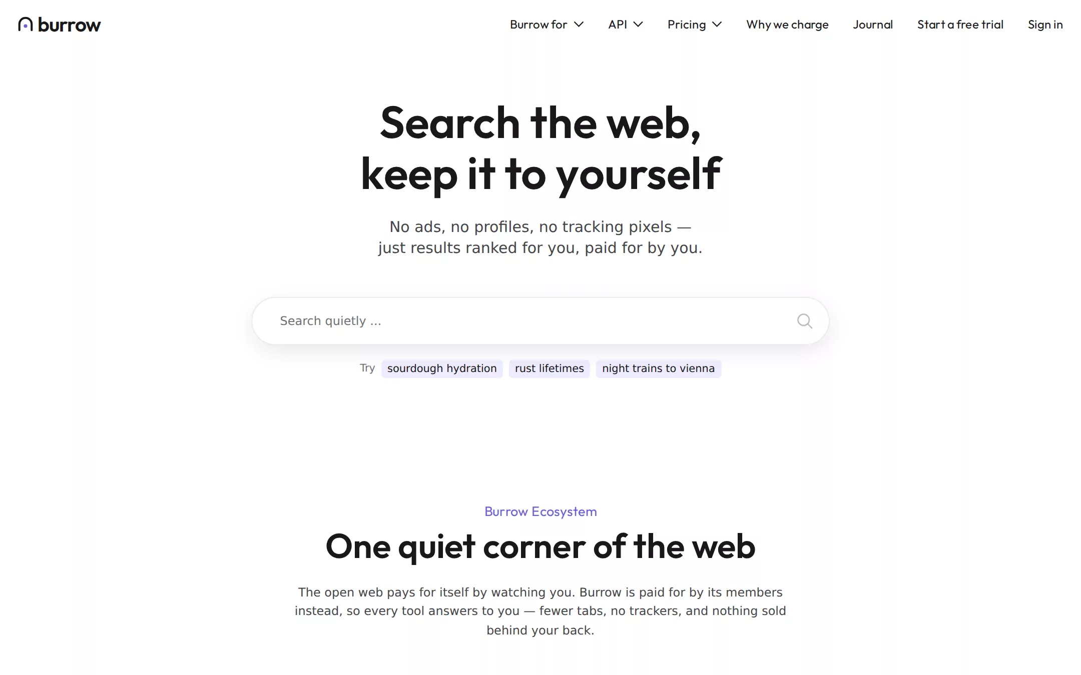
An original Burrow private-search page on white: a full-width 64px navigation of plain text links, a centered two-line 60px headline over a 770px pill search field with suggestion chips, an ecosystem section of gold and lavender product panels holding white search and assistant screens, a browser split on mist, three white tool tiles, a Burrow for row list with flat apricot and mist panels, a graphite FAQ accordion and a graphite footer.
- Best forPrivacy-first consumer software, subscription search or AI tools, browsers and small product suites that want quiet, trustworthy whitespace instead of a loud gradient hero.
- Tech stack- Next.js (App Router) - React - TypeScript - CSS custom properties Use Next.js App Router, React and TypeScript with plain CSS custom properties for every colour, radius, shadow and spacing token. Render the page as a server component; the FAQ accordion is native details/summary and the navigation dropdowns are the only small client component. Load Outfit (400, 500, 600) as self-hosted woff2 via next/font/local and leave body copy on the system stack — no remote font request. Draw the mark, chevrons, magnifier, tool icons and every product screen as HTML and inline SVG with fixed content, so the markup is deterministic between renders. Provide page metadata. Build and run the production page before capturing its preview.
The prompt. 1933 words, self-contained.
Build the "Kagi" kickstart — A calm private-search landing page: a centered graphite headline over a soft pill search field, one violet signal for links, and flat gold, lavender and mist panels holding the product screens.

## Design
Build a rebrandable landing page for a member-funded private search engine.

Create a complete landing page for Burrow, a fictional ad-free search engine paid for by its members, with an AI assistant, a browser and a few small private tools around it. Its core idea: a private reading room — open white space around decisive graphite headlines, a single calm violet signal for links, and warm flat pastel panels that hold the product screens. This is a concept presentation, not a real company — no real customers, people, metrics or awards. Use original branding, artwork and copy throughout.

Color: White #FFFFFF is the page canvas, the header, the search field and the utility tiles. Graphite 1000 #18181A is every headline, the navigation, the filled capsule buttons and the inverted FAQ and footer bands — never pure black. Graphite 800 #454549 is body copy and the hero subtitle. Graphite 100 #E6E6E8 is every hairline: the search-field border, tile borders and the rules between the Burrow for rows. Graphite 600 #707077 is placeholder and helper text; Graphite 300 #B7B7BB is the search icon and footer labels; Graphite 200 #CFCFD1 is FAQ answers and footer links; Graphite 900 #2F2F31 is the FAQ row rules. Burrow Violet #6C5EDC is the one vivid colour and it is only ever text: inline links and the section eyebrows — never a filled button. Chrome Lavender #EFECFF is the small suggestion chips under the search field, with Graphite 1000 text. The product panels are flat, isolated surfaces: Sunlit Gold #FFB319 (Search), Lavender Panel #C9C1FF (Assistant), Mist #D6E3E8 and Soft Apricot #FFE1A4 (the Burrow for rows). No gradients. Only two shadows exist: rgba(0, 0, 0, 0.09) 1px 8px 30px 0px under the hero search field and rgba(0, 0, 0, 0.22) 0px 0px 24px 0px around the white product screens inside the coloured panels.

Typography: a friendly geometric display face for every headline and the navigation, and the reader's own system font for reading. Headlines use "Outfit", "Lufga", system-ui, sans-serif: the hero headline 60px/67.98px weight 600, section headings 46px/51.98px weight 600, card titles 24px/31.92px weight 600, FAQ questions 24px/32px weight 500, the navigation 16px/24px weight 400, section eyebrows 18px/28.8px weight 400 in Burrow Violet. Body copy uses system-ui, -apple-system, BlinkMacSystemFont, "Segoe UI", Roboto, "Helvetica Neue", Arial, sans-serif at weight 400: the hero subtitle 20px/28px, section intros and card copy 16px/25.6px, button labels 14px/22.4px, chips 14px/22.4px, footer labels and links 14px/20px. No letter-spacing anywhere, no uppercase, no italics, no third family.

Shapes and spacing: product panels and utility tiles have a 24px radius and 24px padding; the white product screens inside them a 12px radius; the search field a 32px radius; capsule buttons a 48px radius with 7px 24px padding and a 38px height; chips a 5px radius with 1px 8px padding. A 1176px page maximum with 32px side padding (a 1112px content column); 64px between sections, 24px between elements inside a card, 64px from a section intro to its grid. Sections flow straight down the white canvas with no dividers or boxes around editorial copy.

Navigation: a 64px white bar across the full width with 24px side padding and no border. Left: the Burrow mark — a 20px graphite arch (an open burrow doorway, 3px stroke, round caps) with a small Burrow Violet dot inside — and the lowercase wordmark burrow in Outfit 600 27px at -0.02em. Right-aligned, 32px apart, in Outfit 16px: Burrow for, API and Pricing as text buttons each followed by a thin 14×8px chevron 8px after the label, then Why we charge, Journal, Start a free trial and Sign in as plain text links. No bordered or filled control in the bar.

Hero (id top): a centered stack in the content column, 540px tall, starting 64px below the navigation. The headline on two lines: Search the web, / keep it to yourself. 24px below, the subtitle on two centered lines in Graphite 800: No ads, no profiles, no tracking pixels — / just results ranked for you, paid for by you. 52px below, a 770×64px pill search field: White, a 1px Graphite 100 border, 32px radius, the soft search shadow, the placeholder Search quietly ... in Graphite 600 at 16px with 37px left padding, and a 22px outlined magnifier in Graphite 300 at the right. 20px below, a centered row: the word Try in Graphite 600, then three Chrome Lavender chips — sourdough hydration, rust lifetimes, night trains to vienna — 8px apart. Then plain white space.

Ecosystem (id ecosystem): centered intro — the eyebrow Burrow Ecosystem, the 46px heading One quiet corner of the web, and a 660px Graphite 800 paragraph: The open web pays for itself by watching you. Burrow is paid for by its members instead, so every tool answers to you — fewer tabs, no trackers, and nothing sold behind your back. 64px below, two equal cards 24px apart. Each card is a 425px coloured panel holding a white product screen, then, unboxed below it, a 24px title 32px down, a 16px paragraph and a Graphite 1000 capsule button. Card one: a Sunlit Gold panel whose screen is a small results page (wordmark, a query field reading sourdough hydration ratio, All / Images / Videos / News / Forums / Maps tabs, three blue result titles with green example.com paths and grey snippets, a Forums thread chip and a hydration-calculator answer); title Burrow Search, copy Results ranked by what's useful, not who paid. Block a site forever, lift the ones you trust, and never see a sponsored link., button Get started. Card two: a Lavender Panel whose screen is an assistant (a thread list on the left; on the right a grey user bubble Which night trains reach Vienna from Brussels?, a violet ▸ Searched with Burrow · 6 sources line, a two-paragraph answer and an Ask a follow-up… box); title Burrow Assistant, copy Ask the leading AI models anything, grounded in Burrow's own results. Your prompts are never stored for training and never shown to anyone., button Start a thread. Below both, an unboxed split: Hollow Browser — a 24px title, a 480px paragraph about a browser with tracker blocking built in, and a Learn more capsule on the left; on the right a 540px Mist panel holding a white browser-window screen.

Essentials (id essentials): centered intro — eyebrow Web Essentials, heading Small tools, nothing watching, a two-line paragraph — then three equal white tiles 12px apart with a 1px Graphite 100 border, 24px radius and 24px padding: a 52px two-tone outlined icon (graphite strokes with one small Lavender Panel, Sunlit Gold or Mist fill), a 24px title and a 16px Graphite 800 paragraph — Burrow Translate, Burrow Digest (a daily news brief), Burrow Summaries. A centered 16px line below links to the full list of tools in Burrow Violet.

Burrow for (id teams): centered heading Burrow for every desk, then three unboxed rows separated by 1px Graphite 100 rules, each a 500px text column (24px title, 16px paragraph, Learn more capsule) on the left and a 297×263px flat panel with a 24px radius on the right — Burrow for Teams (Mist), Burrow for Schools (Soft Apricot), Burrow for Families (Lavender Panel).

FAQ (id faq): a full-bleed Graphite 1000 band with 64px padding. The centered heading Frequently asked questions in White at 46px, then a 1112px accordion: each row a White 24px/32px weight-500 question with a thin White chevron at the right, a 1px Graphite 900 rule beneath, and, when open, a Graphite 200 16px/25.6px answer 24px below the question with no panel. Six questions: Why pay for a search engine?, What does Burrow know about me?, Can I try it for free?, How much does a membership cost?, Do you train AI models on my searches?, Can I bring my family or team?

Footer (id contact): Graphite 1000 continuing from the FAQ, 48px top and bottom padding. A 24px line Your web. Your questions. Your time. in White, a small flat illustration of the arch mark beside it, then five columns of 14px/20px links in Graphite 200 under Graphite 300 group labels with 12px row gaps (Burrow, Products, Resources, Company, Legal), then 12px small print: © Burrow — a fictional sample company.

## Tech stack
- Next.js (App Router)
- React
- TypeScript
- CSS custom properties

Use Next.js App Router, React and TypeScript with plain CSS custom properties for every colour, radius, shadow and spacing token. Render the page as a server component; the FAQ accordion is native details/summary and the navigation dropdowns are the only small client component. Load Outfit (400, 500, 600) as self-hosted woff2 via next/font/local and leave body copy on the system stack — no remote font request. Draw the mark, chevrons, magnifier, tool icons and every product screen as HTML and inline SVG with fixed content, so the markup is deterministic between renders. Provide page metadata. Build and run the production page before capturing its preview.
Where the repo you are working in already has an equivalent in place, keep the repo's choice and say which one you kept.

## Everything else
Keep Burrow clearly fictional and rebrandable: no real company, mascot, product names, logos, people, metrics or copy; every result, domain and answer in the product screens is invented (example.com domains). Burrow Violet #6C5EDC is text only — links and eyebrows — and never fills a button; the only filled button is the Graphite 1000 capsule. Never use a radius below 24px on a panel or tile, never replace the 48px capsule with a square button, never put editorial copy in a box, never add a gradient or any shadow beyond the two named. Every link leads to a real section on the page; the search field and chips do not submit or store anything. Content is initially visible — no marquee, carousel, autoplay or scroll reveal. Hover and focus: links underline, capsules lift to Graphite 900 #2F2F31, the search field's border turns Graphite 1000 on focus; transitions are 120ms and stop for prefers-reduced-motion. WCAG AA contrast on every pair (Graphite 1000 and Graphite 800 on White, Chrome Lavender and every pastel panel; Burrow Violet and Graphite 600 on White; White and Graphite 200 on Graphite 1000), a visible 2px Graphite 1000 focus outline with a 2px offset on light surfaces and White on dark ones, and a 360px layout without horizontal overflow where the navigation collapses to the mark, a Menu button and Sign in, the hero headline drops to 36px/42px, the search field fills the column, the chips wrap, and every grid and split becomes one column with the panel above its copy.

### Non-negotiables
- Responsive from 360px through desktop — no horizontal page overflow at any width. Deliberately scrollable regions stay within the viewport and remain keyboard and touch accessible.
- Every text/background pair clears WCAG AA (4.5:1 for body, 3:1 for large text); adjust a tint rather than shipping a failing pair.
- Fully keyboard operable, with a visible focus ring drawn in the accent colour.
- Honour `prefers-reduced-motion` — swap every transition for an instant state change.
- Write real copy in the voice described above; no lorem ipsum and no TODO placeholders.
- Use system or self-hosted fonts and CSS/SVG-drawn graphics — do not depend on a remote image or icon service.

Build the whole page end to end and show me the result running — not a description of it.